

close
Choose Your Site
Global
Social Media


Views: 0 Author: Site Editor Publish Time: 2026-05-29 Origin: Site


Packaging no longer serves as a mere carrier for your products. Modern retail and e-commerce treat every package as an active marketing channel. When customers carry your branded packaging down the street, it becomes a mobile billboard.
While the desire to print a logo on your packaging is common, execution failures happen frequently. Brands often struggle with patchy ink, illegible logos, or structural tearing. These preventable mistakes actively harm brand perception and waste marketing budgets. You want your customers to feel proud holding your items, not frustrated by smeared ink on a flimsy handle.
This article provides a definitive roadmap for your packaging decisions. You will learn how to evaluate different structures, select the right commercial printing methods, and avoid technical design errors. We will also show you how to source a reliable packaging partner to scale your branding efforts successfully.
Aligning the physical bag structure (e.g., SOS bags, Eurototes) with your business use case (retail, takeout, luxury) is the mandatory first step before print selection.
The choice between Flexographic, Screen, Digital, or Foil Stamping depends heavily on order volume, color complexity, and desired brand texture.
Technical design preparation—specifically vector formatting, 300 DPI resolution, and strategic color contrast—prevents costly commercial printing errors.
Scaling from low-cost DIY printing to commercial runs requires balancing Minimum Order Quantities (MOQs) with unit-cost economics and consistency.
You must choose the correct structural foundation before you even consider ink colors or logo placement. A beautifully printed logo means nothing if the packaging fails to hold the product properly.
Different product categories demand entirely different physical properties. Flat merchandise bags work perfectly for lightweight items. Boutiques often use them for greeting cards, jewelry, or thin apparel. They offer a slim profile and cost less to ship.
However, heavier goods require robust support. Gusseted, flat-bottom bags provide essential structure. The expandable side gussets and flat base allow the bag to stand upright. This physical stability is critical for retail shopping and heavy food takeout containers. They prevent food boxes from tipping over during transit.
Your chosen material communicates your brand identity instantly. It also dictates how your printed logo will look.
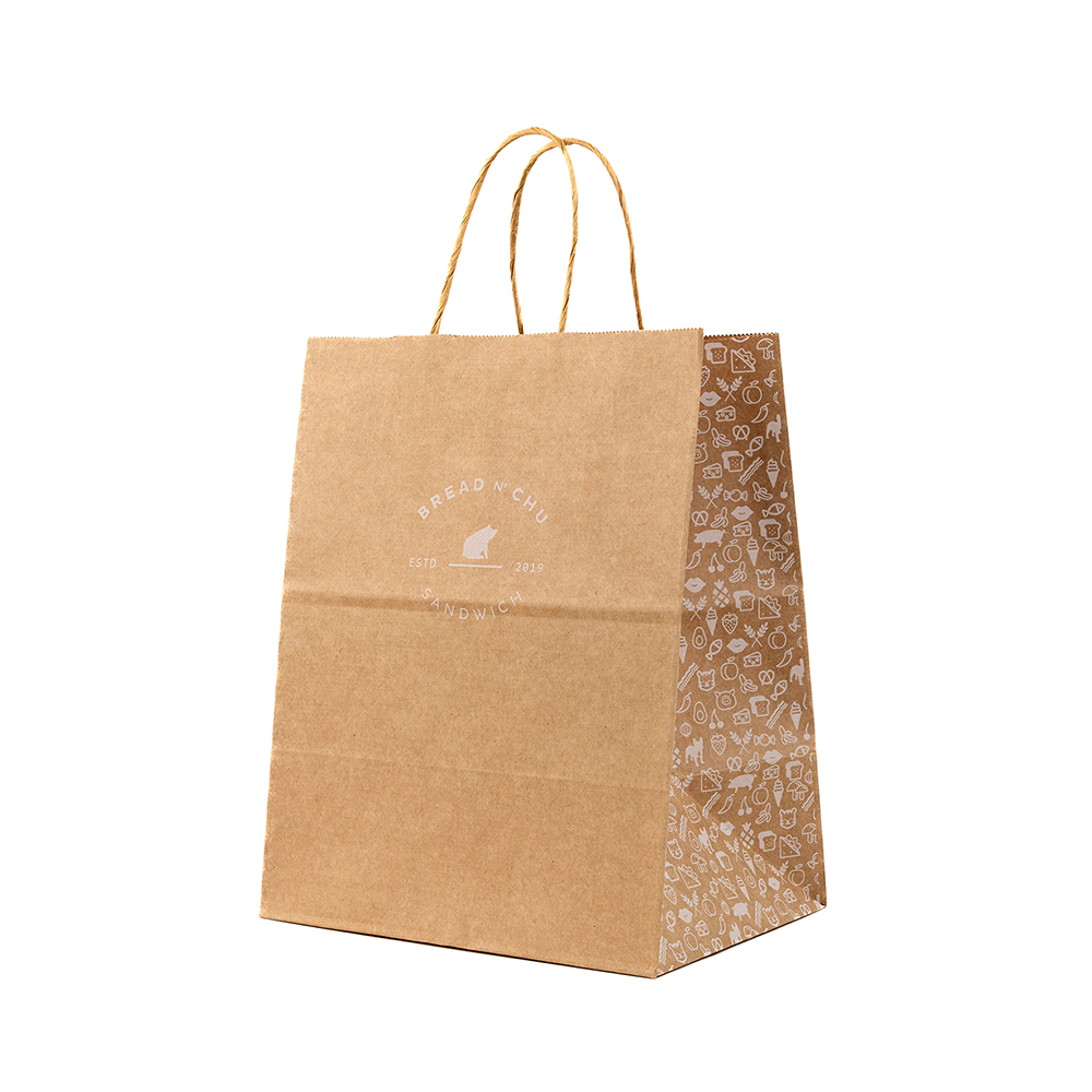
Recycled Kraft: This stands as the industry standard for eco-conscious, organic, or rustic brands. Interestingly, the word "kraft" originates from the German and Swedish word for "strength." It implies durability. Keep in mind that recycled kraft has visible natural fibers. These fibers actively absorb ink, which softens crisp lines and mutes vibrant colors.
White Paper: White materials remain optimal for high-contrast, minimalist, or luxury branding. Logo clarity is paramount here. A pristine white background allows deep blacks and bright brand colors to pop off the surface. If exact color matching is critical to your brand guidelines, white paper is your safest bet.
Handles blend functionality and budget. You must balance the customer experience against your per-unit costs.
Self-Opening Sacks (SOS bags) traditionally feature no handles. They open quickly and stand on their own. Quick-service restaurants favor them for speed and cost efficiency. For standard retail, twisted paper handles offer a comfortable grip and excellent durability. If you sell premium goods, consider woven rope handles on Eurotote bags. These luxurious details elevate the unboxing experience and encourage customers to reuse the bag.
Printing technology dictates both the aesthetic quality and the financial viability of your project. You cannot choose a print method based on looks alone. You must align it with your expected order volumes and color complexity.
Flexographic and screen printing remain the best choices for simple, one-to-two color logos at high volumes. Flexography uses flexible relief plates to stamp ink onto the surface rapidly. It is highly cost-effective per unit once you meet the minimum order quantities.
Screen printing pushes ink through a mesh stencil. It leaves a thick, vibrant layer of ink on the surface. Both methods handle solid colors beautifully. The trade-off? They struggle with intricate gradients and photographic elements.
Digital printing functions much like your office inkjet printer, but on a massive commercial scale. It is ideal for full-color designs, complex gradients, and photographic elements. Digital setups require very little physical prep work. This makes lower MOQs highly accessible for small businesses.
Note a critical limitation here. Achieving absolute color-matching on textured materials is difficult. The ink sits differently on recycled fibers compared to smooth, coated surfaces.
Hot foil stamping applies metallic or colored foils to the surface via intense heat and pressure. Embossing creates a raised physical texture.
Frame these methods as investments rather than simple packaging expenses. They yield the highest return for luxury goods. The premium finish justifies a higher unit cost because it communicates exclusivity and high value to the consumer.
You need a simple heuristic to guide your decision. Choose digital printing for low-volume, full-color runs. Choose flexographic printing for high-volume, single-color runs. Use foil stamping strictly for premium retail where margins justify the cost.
Printing Method | Best Use Case | Volume / MOQ | Key Limitation |
|---|---|---|---|
Flexographic | Simple 1-2 color logos | High (10,000+) | Poor gradient reproduction |
Digital | Full-color, photos | Low to Medium | Color shifts on textured bases |
Screen Printing | Vibrant single colors | Medium | Slow production speed |
Foil Stamping | Luxury, metallic accents | Low to Medium | High per-unit cost |
Even the best printing equipment cannot fix a flawed design file. Technical preparation prevents costly commercial printing errors.
Ink-to-paper visibility requires careful planning. Many designers mistakenly use light colors—like pastel yellow or pale pink—on brown kraft material. Those colors simply disappear into the natural brown background. Always recommend dark, bold inks for kraft materials. Navy blue, forest green, and deep black provide excellent contrast.
Remember how white space works. Unprinted areas will simply show the bag's base color. You cannot print "white" ink easily unless you use specialized screen printing or digital setups.
Caution against designing large, solid blocks of single-color ink. This is especially risky on unbleached kraft. Heavy ink coverage often results in noticeable visual inconsistencies. You might see banding, patchy spots, or areas where the natural paper fibers reject the ink. Keep your logo clean and utilize negative space effectively.
You must follow strict technical standards for commercial runs. Submitting low-quality JPEGs guarantees a blurry, unprofessional result. Follow these file preparation requirements:
Vector Format: Submit designs as AI, EPS, or vector PDF files. Vectors scale infinitely without losing quality.
Resolution: If you must use raster images, ensure a minimum 300 DPI (dots per inch) resolution.
Color Modes: Convert all files to CMYK format for digital printing, or provide exact Pantone (PMS) codes for flexo/screen printing.
Outlined Fonts: Outline all text to prevent font substitution errors on the printer's end.
Treat every package as a tool for repeat business. Incorporate secondary conversion elements alongside your main logo. Add a clean QR code linking to your menu or store. Print your physical address and social media handles on the side gussets. A well-designed Paper Bag drives customer retention long after the initial sale.
Scaling your brand often forces a transition from manual operations to commercial partnerships. Knowing when to make this jump saves time and protects your brand image.
Micro-businesses often test concepts using basic, low-cost methods. Home-based bakers or craft sellers might use craft cutting machines to apply vinyl decals. Some even tape flat bags to standard A4 paper and run them directly through standard home inkjet printers. This scrappy approach works beautifully for testing a logo concept on a dozen items.
DIY solutions fail spectacularly at scale. As your daily order volume grows, home printing becomes a massive bottleneck. Registration remains highly inconsistent; your logo might sit high on one bag and skewed on the next. You face high labor times manually feeding items into machines. Furthermore, home printers cannot print edge-to-edge and jam frequently when handling thicker materials.
Transitioning to a commercial wholesale partner unlocks massive benefits. You gain access to automated precision. Commercial facilities use durable, UV-resistant, and water-resistant inks. Most importantly, you secure a significant per-unit cost reduction once you hit specific minimum order quantities (MOQs). Freeing yourself from manual printing lets you focus entirely on growing your business.
Finding the right vendor guarantees smooth production. You need a partner who aligns with your volume needs and brand values.
Never approve a full production run blindly. Always insist on reviewing digital proofs. A digital proof verifies logo placement and scale. If your budget allows, request a physical sample. Physical proofs verify exact color accuracy and structural integrity before you commit thousands of dollars.
Evaluate potential suppliers systematically to avoid logistical headaches. Use this evaluation framework when speaking with sales representatives:
Verify MOQs: Ask if they offer semi-custom low-volume tiers for growing businesses.
Confirm Turnaround Times: Differentiate between standard production times and shipping times.
Check Print Areas: Ask if they support side-gusset printing or full edge-to-edge coverage.
Review Handling Options: Ensure they stock the specific handle types your brand requires.
If environmental messaging forms a core part of your brand identity, audit your vendor's supply chain. Verify they use certified recycled materials. Ask about their ink chemistry. Eco-friendly water-based or soy inks ensure the final printed product remains fully recyclable in municipal facilities. Heavy plastic laminations or metallic foils often render the item unrecyclable.
Successful logo printing requires far more than just a pretty design. You must synthesize your material choices, print technologies, and flawless technical file preparation. Evaluating your physical requirements ensures your packaging holds up under pressure. Matching your volume to the right printing method keeps your unit economics healthy. Finally, following strict contrast rules and vector formatting guarantees crisp, professional results.
Take action today. Finalize your vector logo files and confirm your CMYK or Pantone colors. Then, reach out to three shortlisted commercial printing vendors to request sample kits and digital proofs. Your branded packaging journey starts with that first approved proof.
A: Yes, digital printing allows full-color photographic reproduction. However, the brown base actively mutes the colors. Your bright reds or soft blues will look darker and less vibrant. We strongly recommend white materials if accurate photographic color matching is essential to your design.
A: It depends on the ink and finishing process. Most modern commercial printers use water-based or soy-based inks. These maintain full recyclability. However, applying heavy metallic foil stamping, UV coatings, or plastic laminations complicates the recycling process and may render the item unrecyclable.
A: A standard medium retail bag typically holds between 10 and 13 lbs safely. This capacity varies heavily depending on the material thickness, the base construction, and handle reinforcement. Always test physical samples with your heaviest products before placing a bulk order.
A: Place your primary logo in the optical center of the outward-facing panels. This draws the eye immediately. Reserve the lower third of the panels or the side gussets for secondary details like QR codes, websites, or store addresses.


